


The best websites in the world today do not exist to impress. They exist to communicate. They do not layer complexity upon complexity until users feel lost. They distill information and emotion into a shape that feels intuitive, humane, and purposeful. Modern website design is born out of understanding how humans perceive, how they decide, how they trust, and how they move through digital spaces. It is not decoration. It is architecture. In the examples highlighted by DesignRush, we see a consistent truth emerge: the designers did not merely arrange elements. They listened first and designed second.
The modern internet user does not arrive with unlimited patience. They arrive with questions, expectations, and subconscious judgment. They want clarity, not chaos. They want meaning, not noise. The websites that win today are the ones that absorb this reality and respond with intention every color, every scroll, every interaction shaped to support human behavior rather than interrupt it.
When you open the Umani Ronchi website, you are not met with a promotional headline. You are met with atmosphere. The design understands something fundamental: emotion precedes evaluation. Before a visitor decides to read, click, or engage, they feel. The imagery embraces light and texture. The palette feels calm. The interface feels spacious. All of this is not aesthetic flair. It is psychological structure.
At the start, you sense place before you sense product. That is the key. The site does not demand action. It invites presence. Users are allowed to breathe before being asked to engage. When information arrives, it feels welcomed instead of pushed. The pacing respects curiosity instead of forcing decisions. This is a lesson that many brands never learn: engagement begins with comfort. Umani Ronchi’s design achieves that first. Only then does it guide visitors toward discovery and narrative.
The elegance of this website teaches an essential truth: design shapes emotional orientation. People do not decide whether they trust a brand after reading a paragraph. They feel trust long before the words register. That invisible foundation is what modern design must build first.
The Pharmacy at the Triumphal Arch website feels simple when you first see it. But simplicity here is not empty. It is purposeful. The layout gives ample breathing room to content, guiding the eye instead of crowding it. The palette reflects calm and wellness, but it is not soothing in a bland way. It is grounded, deliberate, and comforting.
What makes this site truly modern is its understanding of cognitive space. Visitors arrive with limited bandwidth. They want quick orientation. They want signals about where to go next. This design offers those signals without shouting. The split choices on the homepage do not overwhelm. They orient. They allow the user to answer the question “Why am I here” instantly without second guessing. That reduces friction, which is where conversion begins.
The visual motion of the floral element introduces warmth and tactility into an interface that could have otherwise felt clinical. Here, movement does not distract. It enhances. It signals life, connection, and narrative. That is the difference between decorative motion and meaningful motion.
Meaningful motion guides attention. It supports the brand’s emotional purpose. This is what makes the Pharmacy site feel more like an experience and less like a portal.
The Prosvirin Design website shows a principle that many modern designers overlook: content is not king. Meaningful content is king. The website uses photography not as ornament but as communicative anchor. Each image is a message. It is not there to decorate a page. It is there to speak.
The design steps aside to allow these visuals to hold space. Typography and layout are quiet and controlled. They do not whisper. They do not get in the way. They let the photography carry the narrative. This approach is bold because it trusts visual communication to be strong enough on its own. That trust is grounded in understanding the audience people today do not want pages filled with text if a photograph conveys emotion, context, and identity more clearly.
What Prosvirin does here is teach a significant lesson: confidence in design comes from aligning form with content strength. If the imagery is evocative and purposeful, the interface should honor that strength with restraint. Modern websites are less about adding and more about revealing what matters.
The portfolio website of Maciej Baska does something most business websites avoid. It embeds personality into the interface. The typography feels handcrafted. There is texture. There is feel. There is narrative.
When a user lands here, they do not simply see a portfolio. They experience a person. This is rare because many portfolio sites behave like generic templates rather than expressions of identity. What sets here apart is not bold fonts or trend driven visuals. It is coherence between message and medium.
Every choice feels intentional. The pacing has weight. The transitions do not rush. The textures do not distract. Instead they pull you into a rhythm that matches the creator’s intent. This site takes a modern principle further than most designers manage: it does not treat interface as neutral background. It treats it as communication partner.
Modern brand experiences must do this. They must express point of view, not just presence. Users today are not persuaded by anonymity. They are persuaded by authenticity.
AR CO’s site embodies a truth that many modern websites overlook: absence is a presence. The design spreads information out. It gives each element room to exist. The whitespace is not blank. It is a field for focus. The black and white palette does not drain energy. It concentrates it.
Modern design is often mistaken for maximal expression. In reality, the best designs create clarity through disciplined restraint. This site exemplifies that philosophy. It is quiet but confident. It does not fill space because it fears silence. Instead it uses space to craft meaning.
When users enter this environment, they feel direction. They feel intentionality. Nothing feels accidental. The experience feels grounded, measured, and sustainable. This is a lesson many brands need: you cannot create clarity by crowding information. You create it by making space for it.
Modern design is not minimalism for style. It is minimalism for meaning.
The website of Katya Smolianinova shows how typography today isn’t secondary. It is identity. The oversized type does more than present a name. It establishes presence. It sets tone. It creates rhythm.
When text carries emotional force, it becomes more than content. It becomes voice. That is the key distinction. This site uses typography not to fill space but to speak. It does not whisper identity into the interface. It announces it. In doing so, it teaches a vital lesson: designers should not be afraid to let type be expressive.
Modern websites succeed when they let identity shine rather than hide it. When typography feels alive, the interface becomes memorable. Users do not just read. They feel.
The NASA redesign concept demonstrates how design can represent vastness without overwhelming the user. The layout honors space. It honors hierarchy. It honors pacing. Nothing is jammed. Nothing is rushed.
This design shows how complexity can be translated into clarity. Users do not need to know everything at once. They need to be guided gently from one layer to the next. Modern design is not about oversimplification. It is about structured exploration.
When content feels expansive, the user should not feel lost. They should feel invited. This is what the NASA concept achieves. The negative space is not emptiness. It is an opportunity. It allows users to breathe before processing new information. That kind of design respects human cognitive limits, and that is what makes it modern.
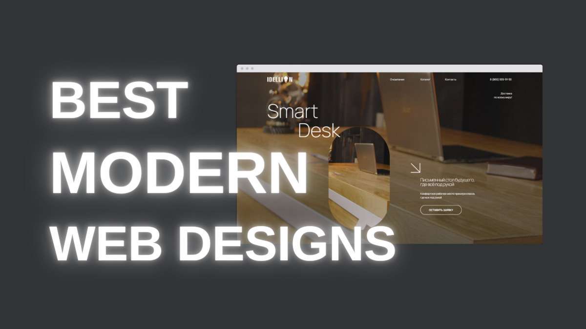
The Smart Desk website illustrates a principle that many brands struggle to implement: design should not make a user work to understand function. This site simplifies decision points with deliberate guidance. The interface does not demand interpretation. It offers direction.
The inclusion of video is not ornamental. It is educational. It answers questions before they are formed. The visual cues that seem subtle are not accidental. They are intentional signposts. Users move not because they were told to, but because the interface showed them where to go.
Modern design works when it respects the user’s time. It does not waste attention. It supports comprehension. This is more than aesthetic. It is behavioral design.
The M T Ads landing page shows how color and motion can embody a product’s essence without overt explanation. The gradients signal energy without chaos. The motion suggests capability without distraction.
This design is not loud. It is purposeful. Modern design today uses motion and color not as spectacles but as communicative signals. They are guiding tools, not noise makers. Each shift, each fade, each gradient transition serves to orient, not interrupt.
This is an advanced understanding of visual language. When color feels symbolic instead of decorative, the experience becomes intuitive
Adtriox Media’s grayscale palette demonstrates that modern design does not require bold colors to be impactful. The tones are quiet but layered. The structure is clear. The focus moves with intention.
When color is subdued, contrast becomes more meaningful. When contrast is meaningful, hierarchy becomes sharper. When hierarchy is sharper, users feel guided rather than overwhelmed.
This website teaches that restraint can be expressive. Modern design is not always about brightness. Sometimes it is about balance.
The WLT Design website feels alive without being chaotic. Interaction here is not animation for its own sake. It is rhythm. It is response. It is connection.
When scrolling feels intuitive, when elements respond with subtle ease, the interface becomes a conversation rather than a stall. Modern design embraces this sense of participation. Users do not feel like observers. They feel engaged.
That is the real power of interaction design done right: it bridges the gap between user intention and brand response. It makes the interface feel human.
All of these sites converge on a single truth. Modern design is not about decoration. It is about meaning. It is not about showing more. It is about revealing what matters.
Modern websites do not interrupt attention. They respect it. They guide rather than push. They anticipate questions before the user has to ask them. They balance emotion with clarity. They reflect identity without confusion.
This is why modern web design matters. It creates experiences that feel intuitive because they were built with human behavior at the center. When design is guided by intention, users do not just interact. They connect.
You must be logged in to post a comment.
Our IT solutions work process begins with a comprehensive assessment